
Objective:
This project is a corporate identity rebrand for Mandarin Restaurant. You must maintain Mandarin’s strengths while appealing to modern sensibilities and broadening its audience. Consistent execution across all touchpoints to ensure the brand remains relevant and vibrant. Modernized the logo, retaining the recognizable elements of the logo but refining its typography and iconography for a cleaner, more contemporary look. A sleeker, less cluttered design can appeal to younger audiences while maintaining familiarity. Use bold, culturally significant colours with a modern twist to evoke tradition and innovation.
Solution:
I designed the colour palette to be more modern and catered towards younger audiences, the Joyous Red & Lucky Gold. The icon gives a nod to the restaurant's first logo, which was a wordmark using a script font. For this, I used a very family-friendly sans serif font with rounded edges, which gives it a very welcoming vibe.
Tools Used:
Adobe Illustrator, Adobe Photoshop
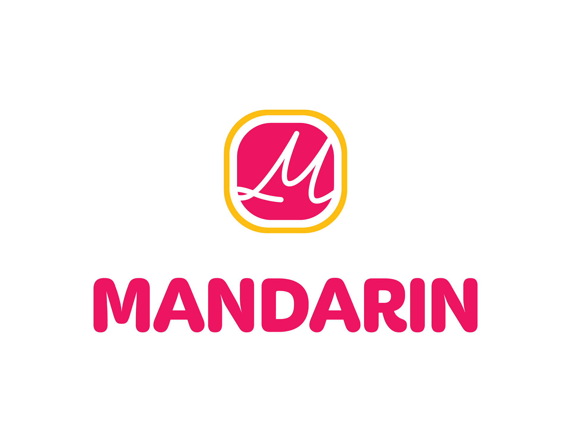
Logo
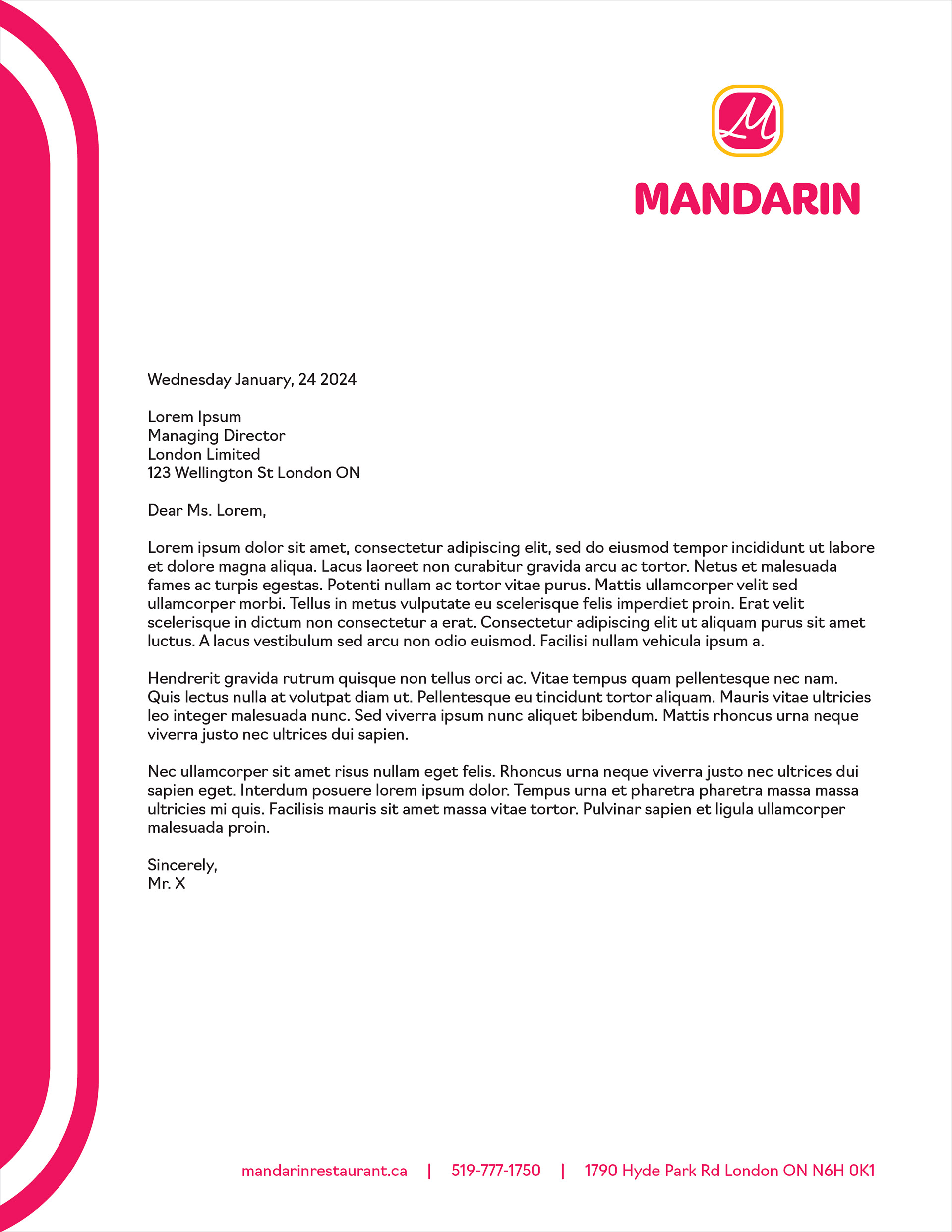
Letterhead
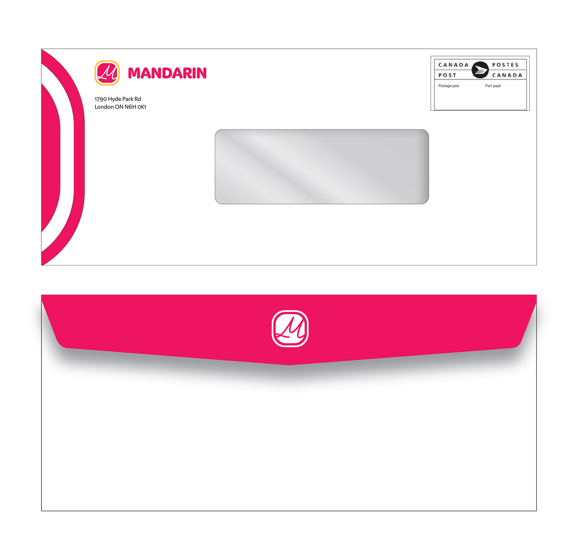
Envelope
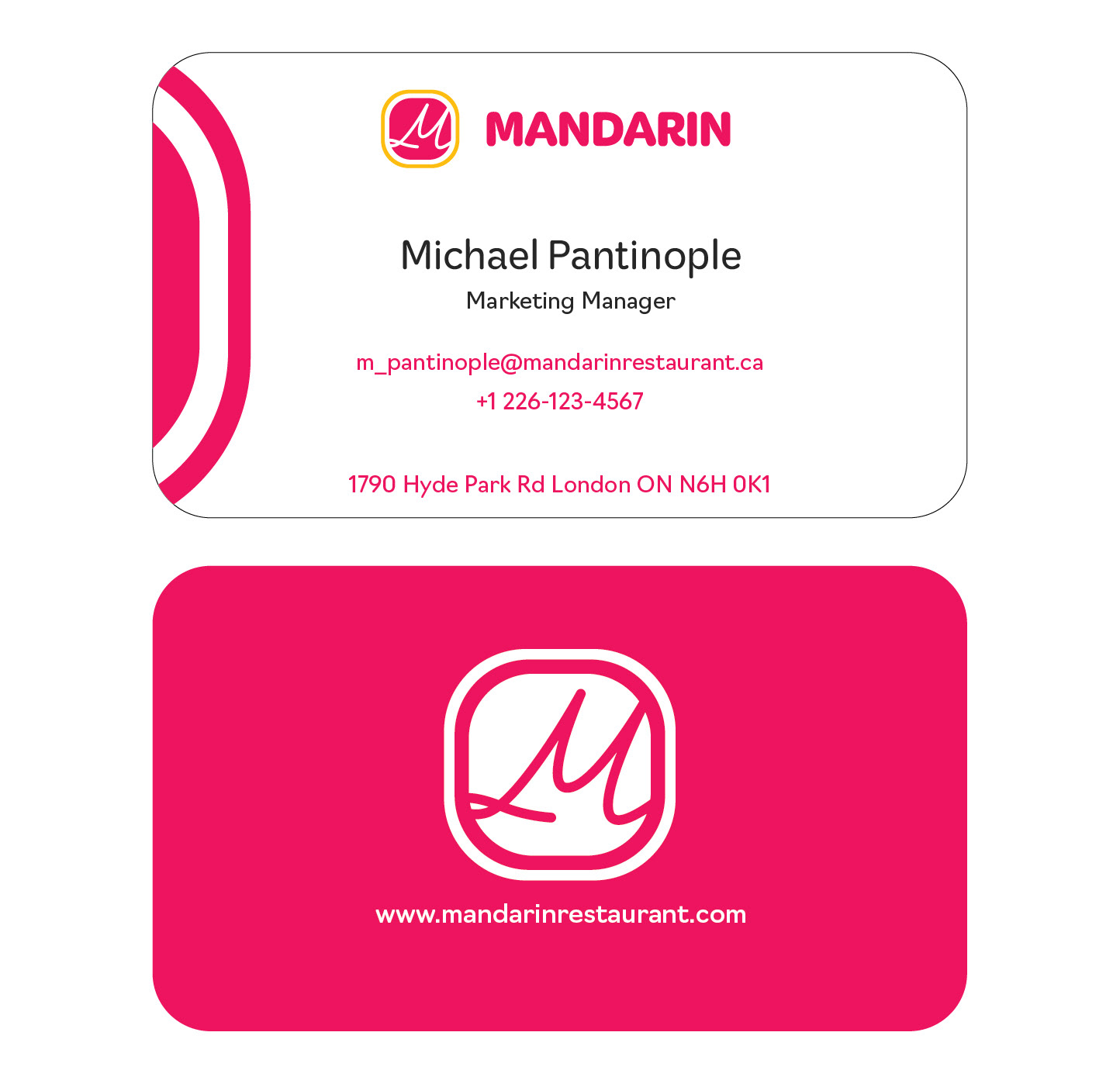
Business Card
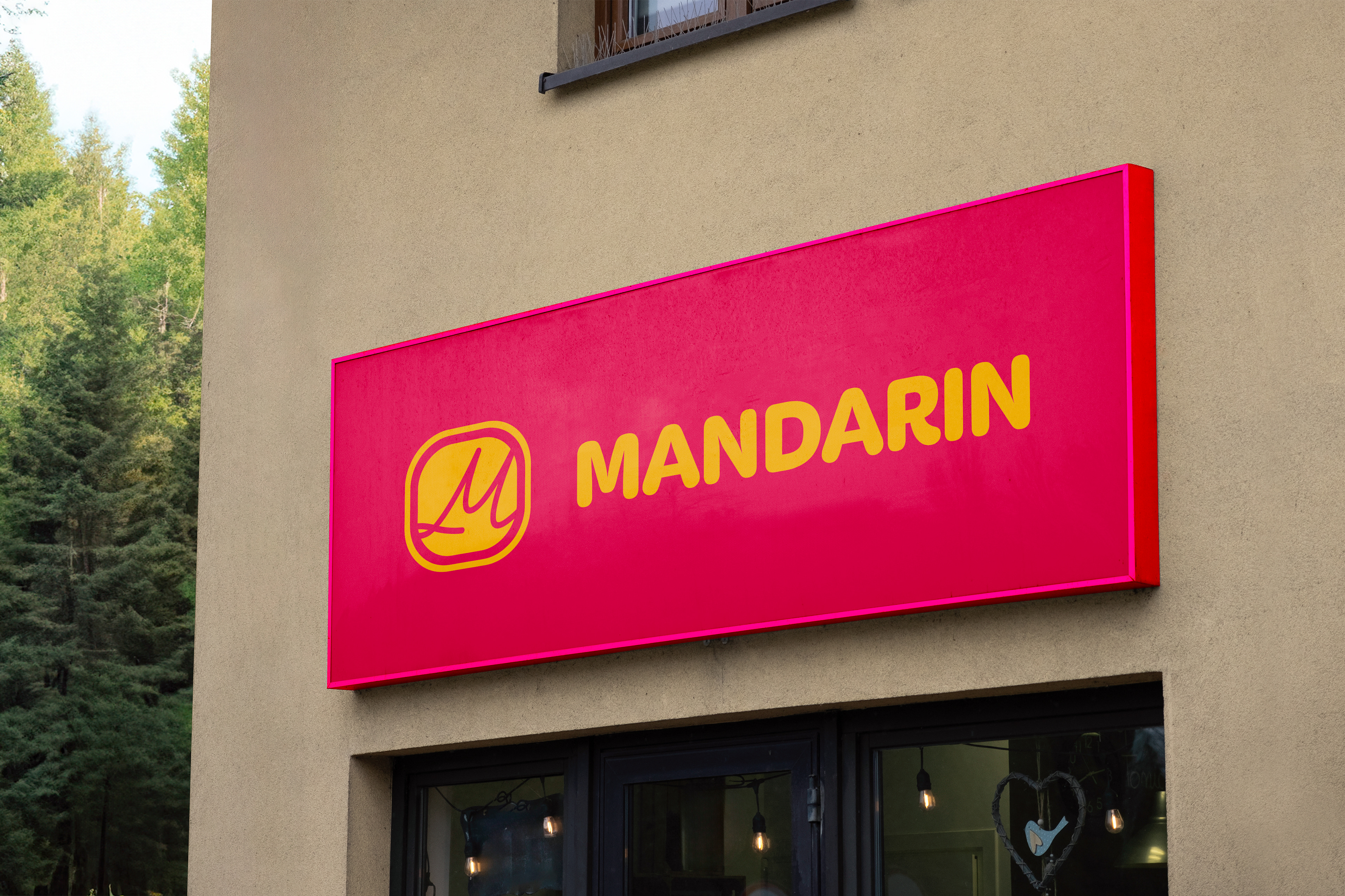
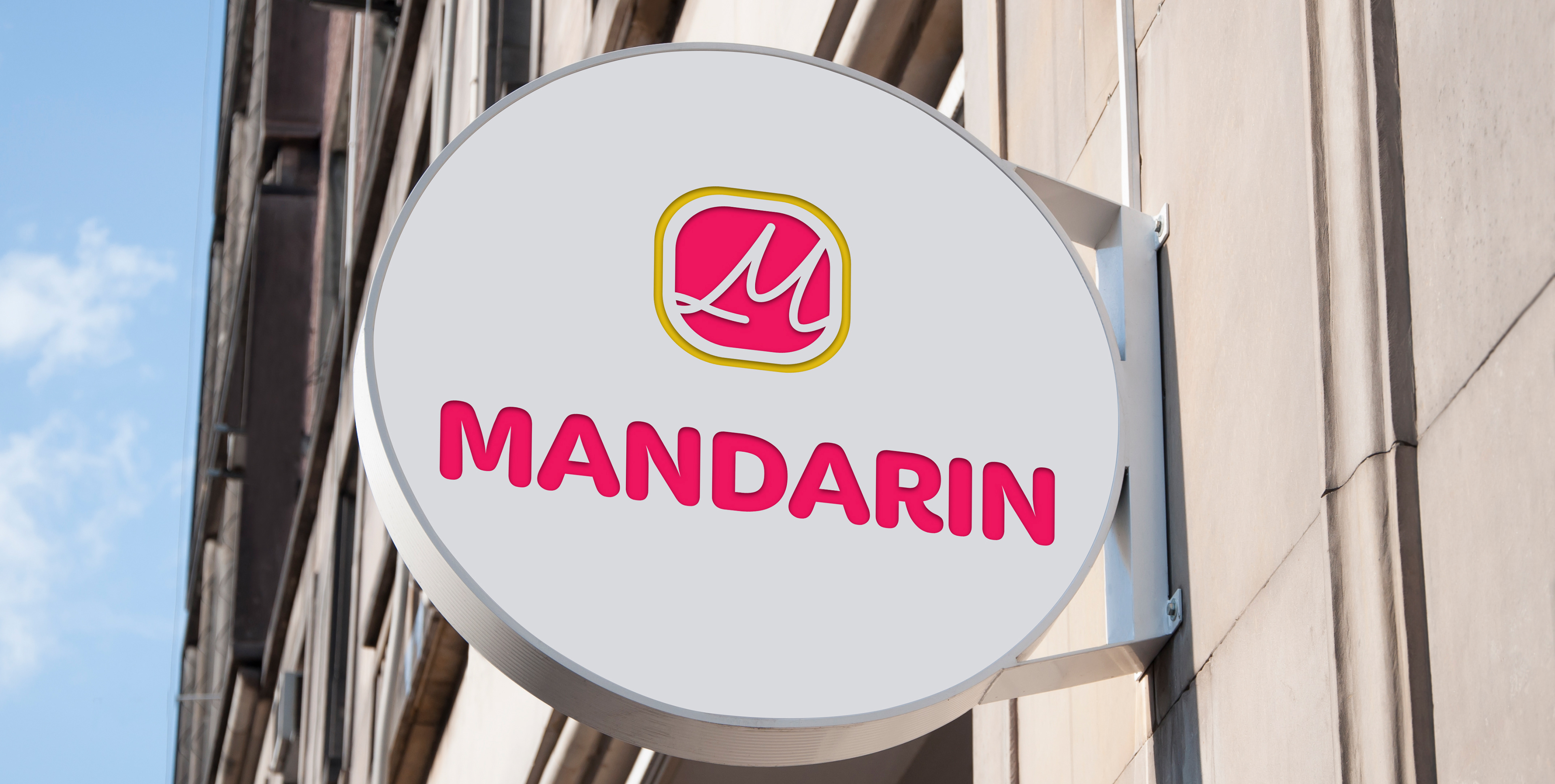
Panaflex Signage
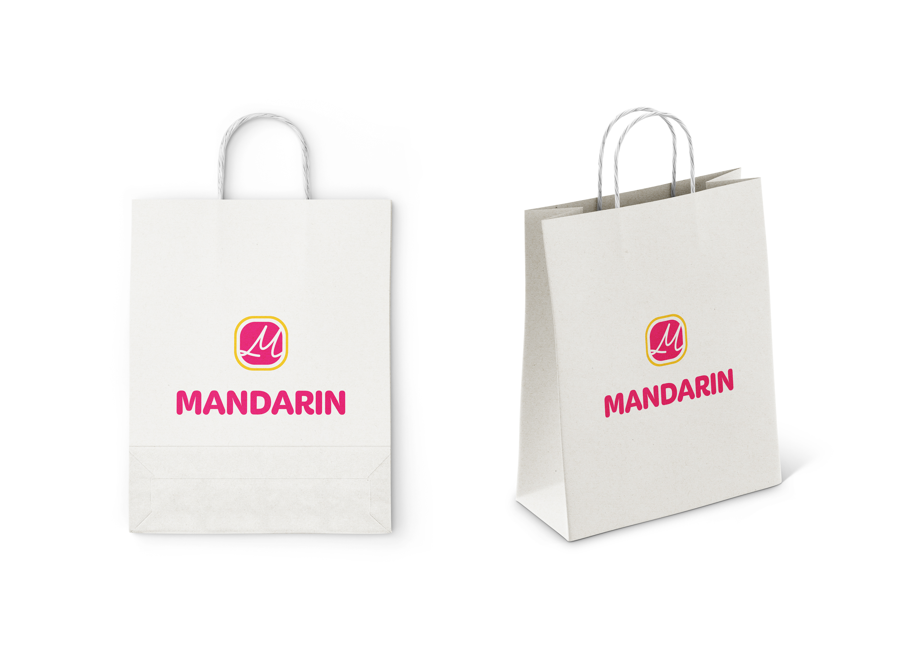
Takeout Bag
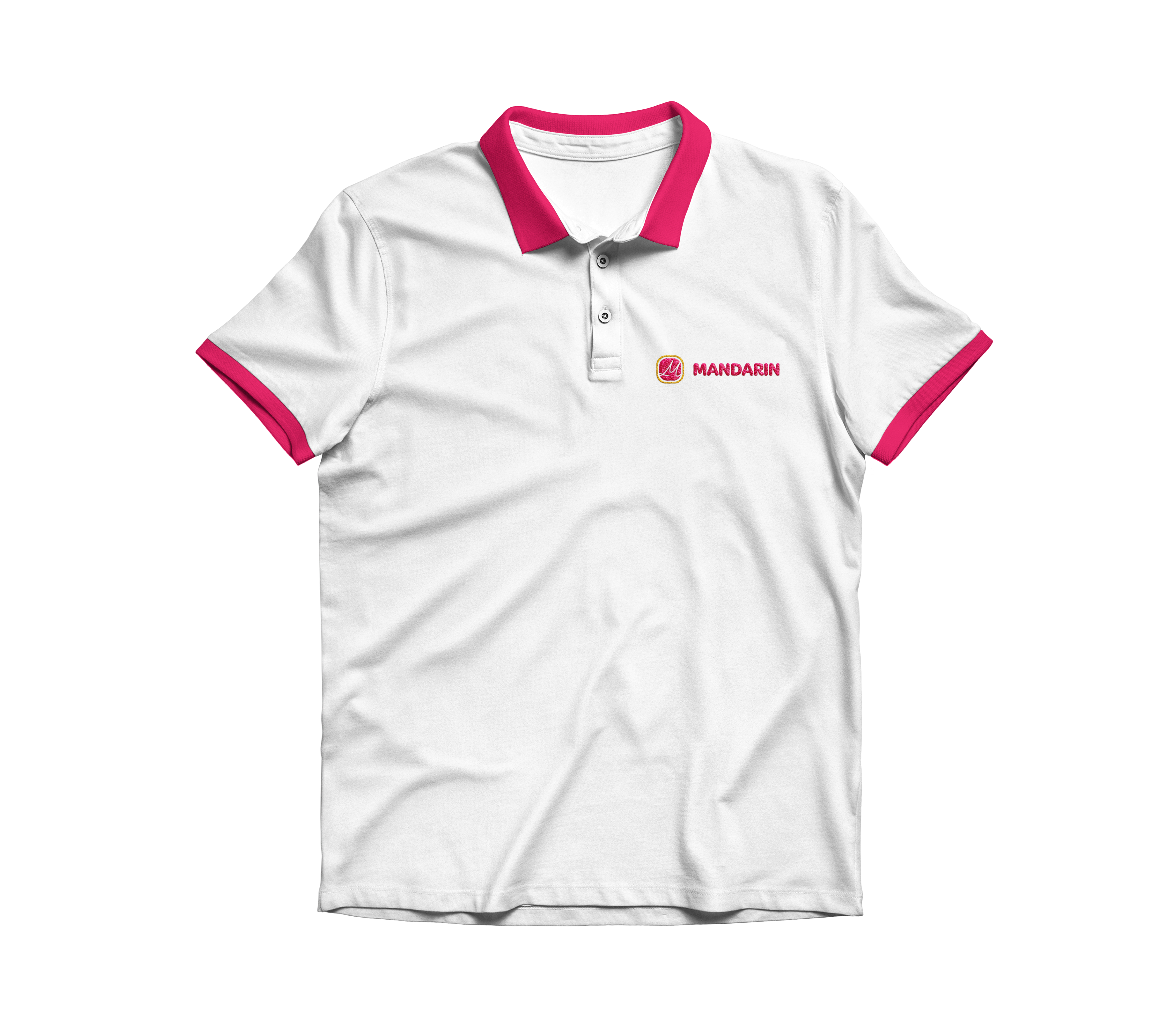
T-shirt Front
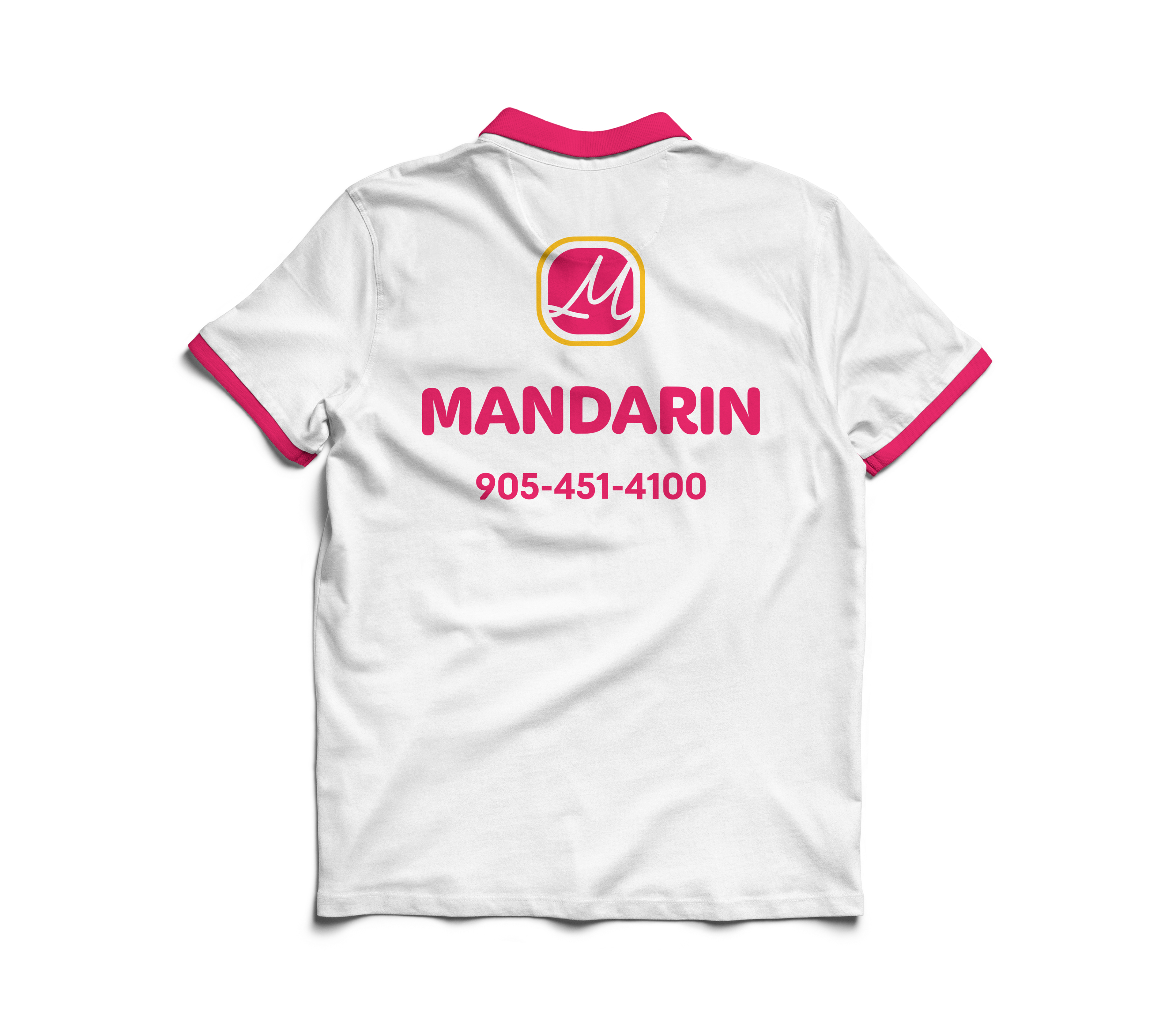
T-shirt Back