Objective:
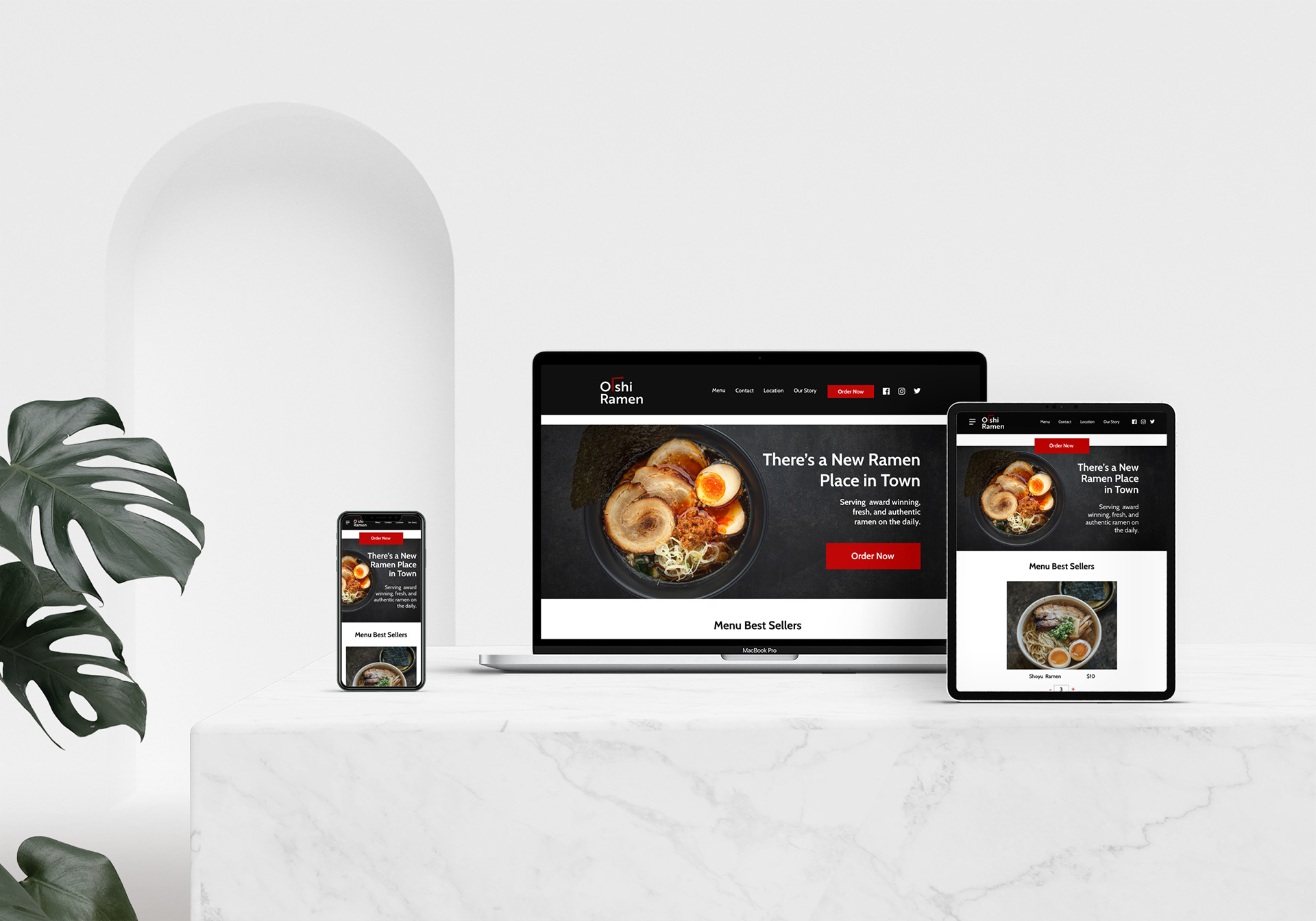
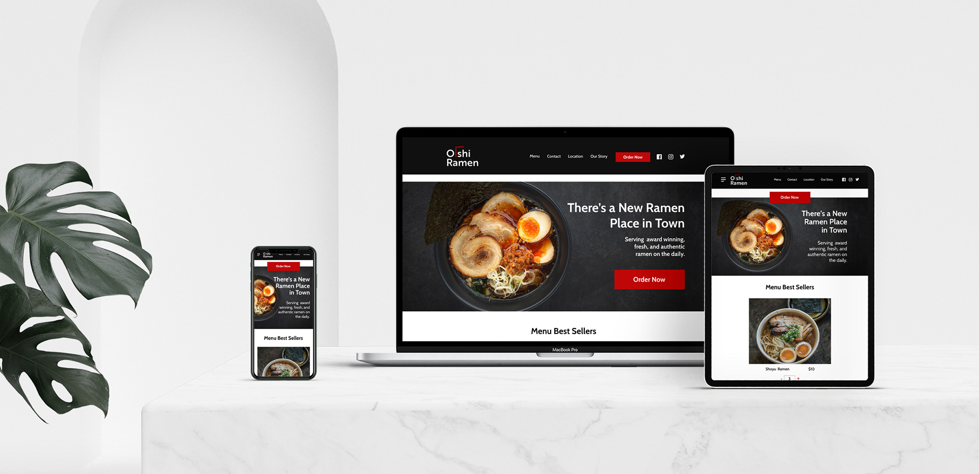
Oishī Ramen is a ramen restaurant new to London, Ontario, and they are looking for someone to design/build a website for their business. You're asked to create responsive web concepts for the second stage of the project. You need to submit 1 high-fidelity concept for the homepage, 3 responsive layouts (i.e, desktop, smartphone, & tablet). You will create the logo - please keep it simple
Solution:
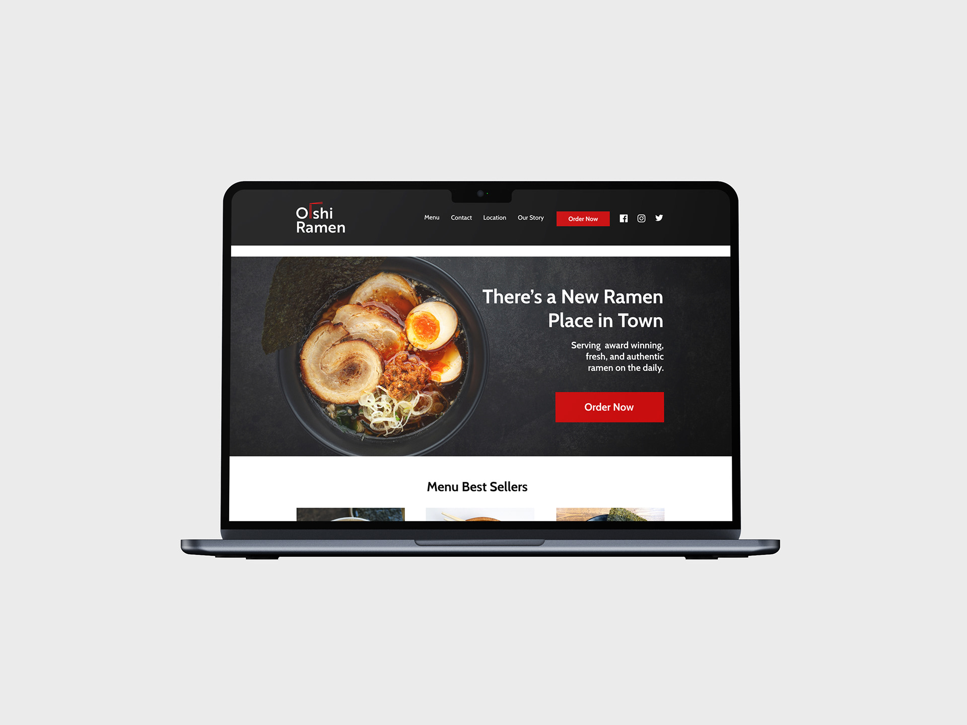
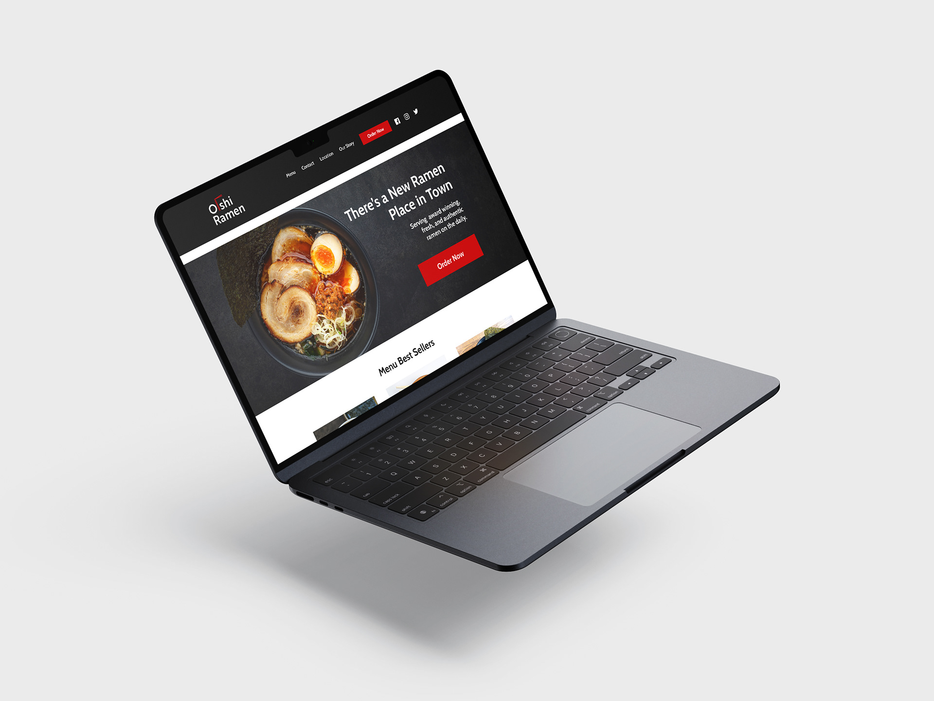
I designed the colour palette to feel both authentic and upscale, making the site inviting and easy to navigate. The layout utilizes generous amounts of whitespace and a clean column grid to maintain readability and alignment. Once the desktop version was complete, adapting it for tablet and mobile was all about smart problem-solving, such as stacking elements vertically to keep things tidy without losing content.
Tools Used:
Adobe XD

Logo on black
Logo on white
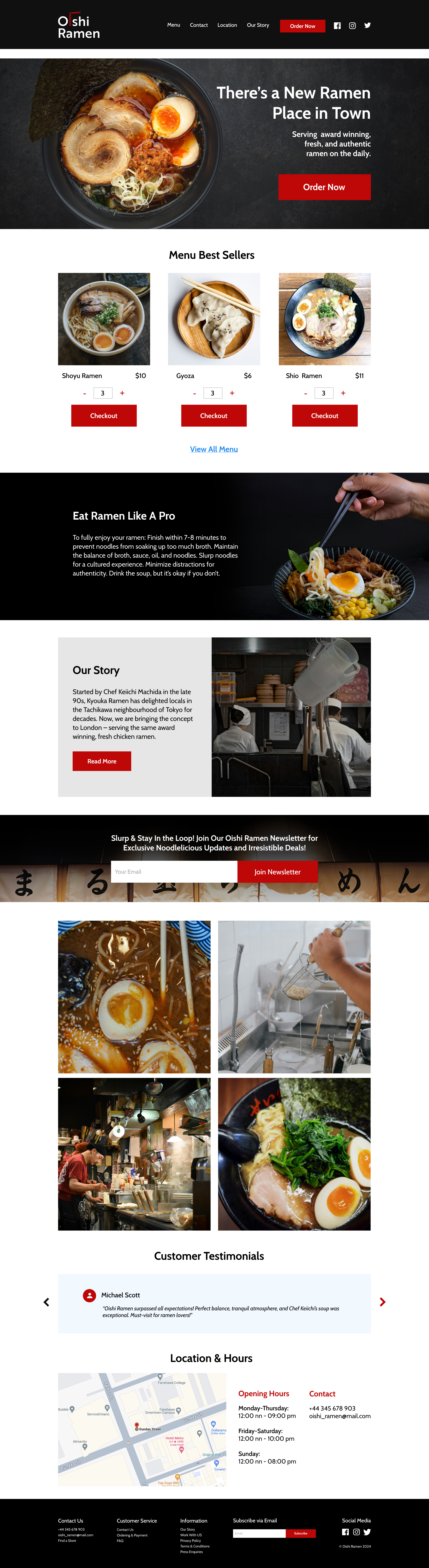
Desktop UI